Financial Education Branding and Logo Design for Game of Money
Game of Money is one of Greece’s most recognizable financial education platforms, bringing together podcasts, educational courses, seminars, live events, festivals, and a growing community focused on financial literacy, entrepreneurship, investing, and personal development.
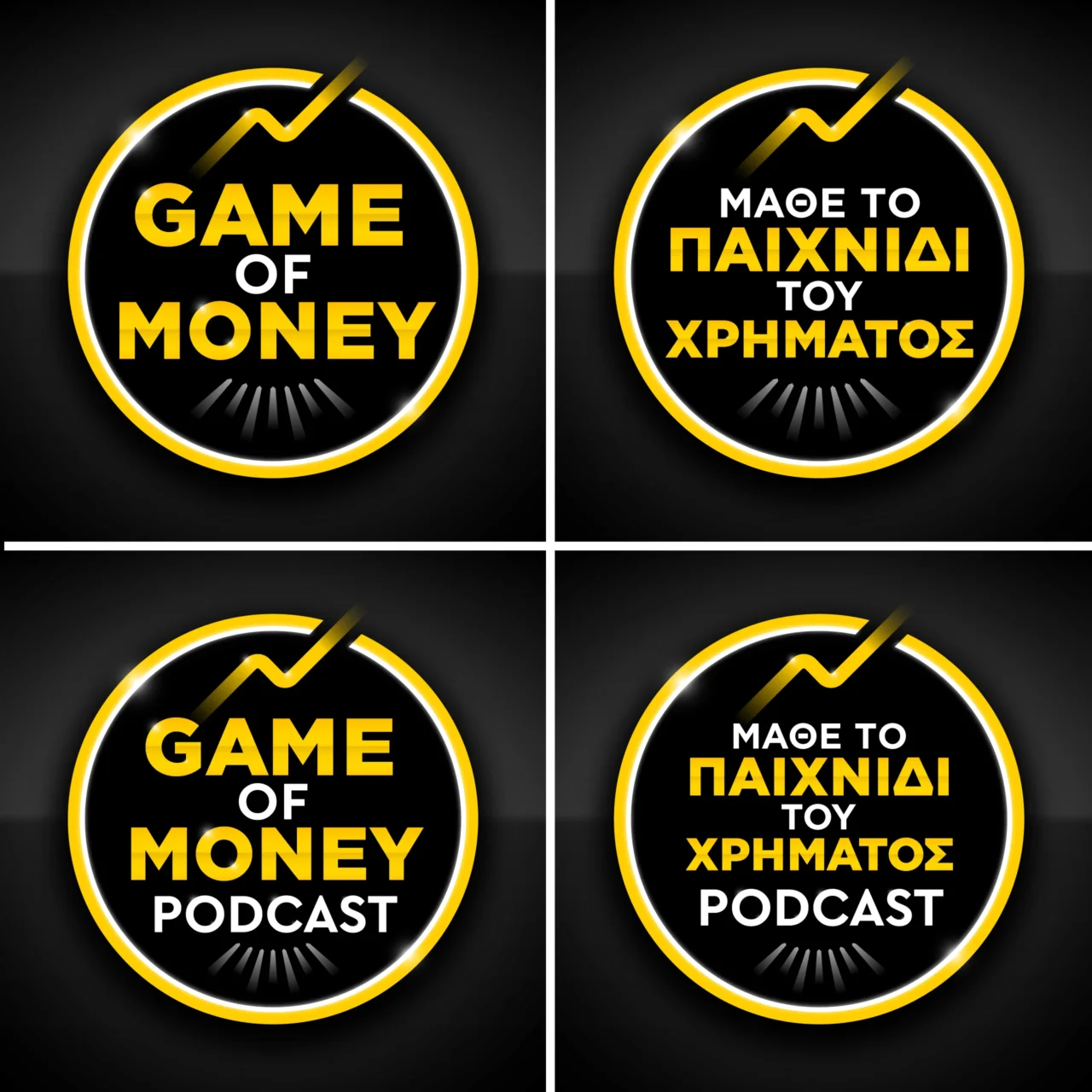
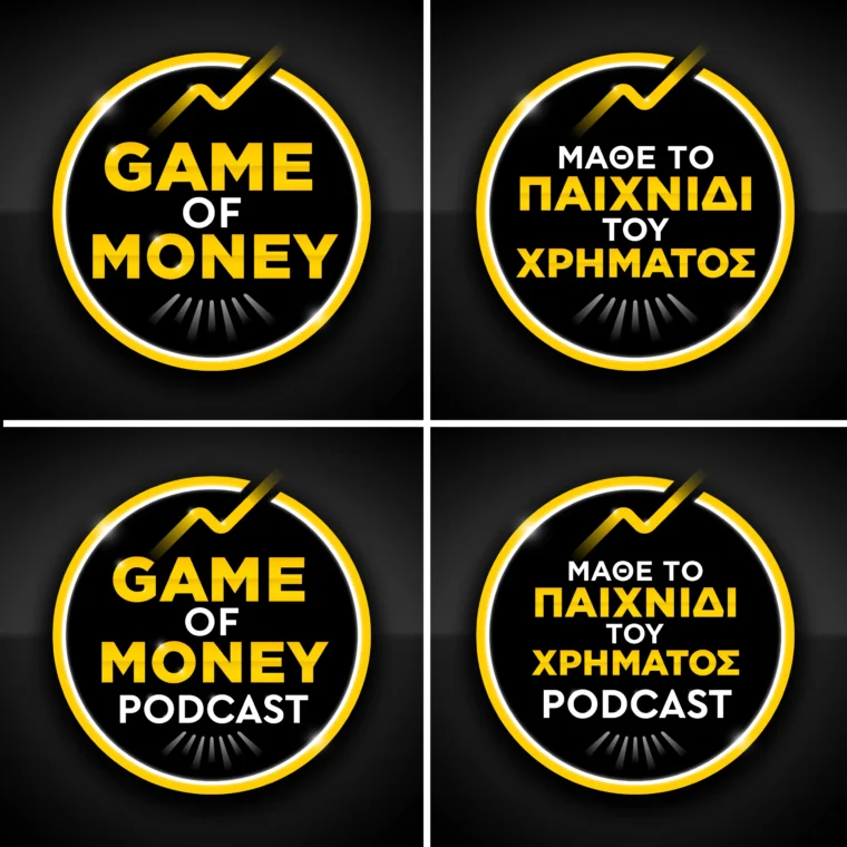
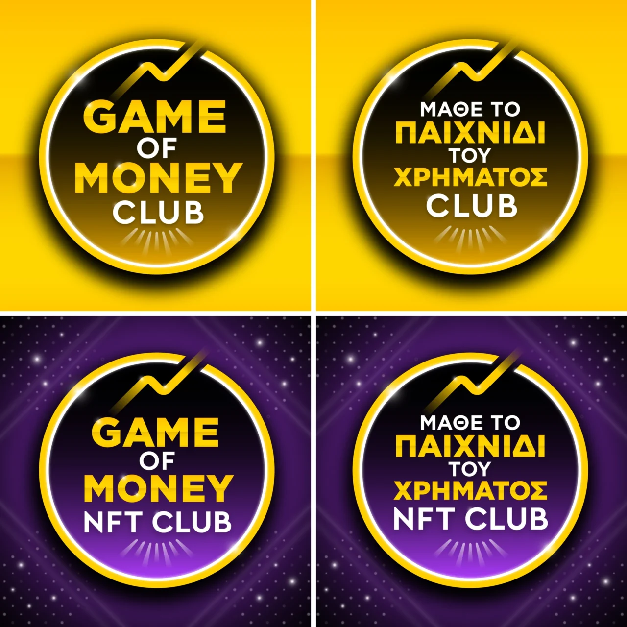
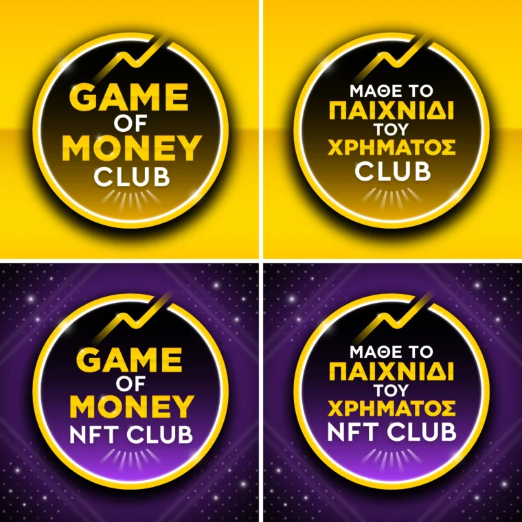
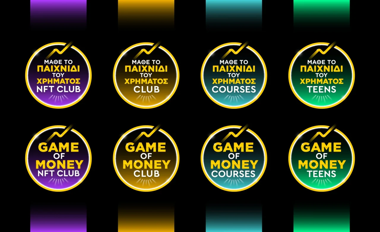
Plus Gravity was commissioned to create the brand’s visual identity, including the main logo design and a family of sub brands such as Game of Money Podcast, Game of Money Club, Game of Money NFT Club, Game of Money Courses, and Game of Money Teens.
The challenge was to create a scalable brand identity capable of supporting multiple educational products, communication channels, and audience segments while maintaining strong recognition and visual consistency across every touchpoint.
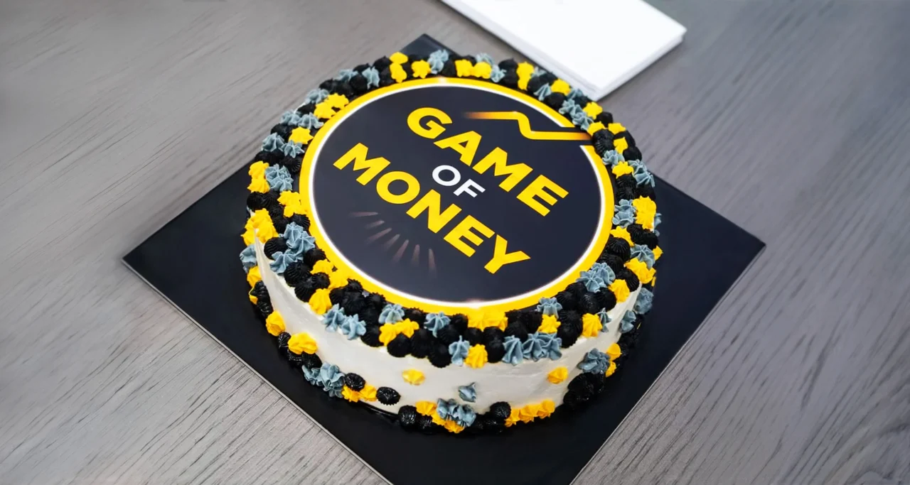
The resulting logo design combines clean geometric forms, contemporary typography, and a distinctive symbolic gesture that communicates growth, progress, knowledge, and the pursuit of financial freedom. The visual identity system was designed to function effectively across digital platforms, educational content, social media, events, merchandise, presentations, and large scale branding applications.
This project demonstrates how strategic logo design, brand architecture, and visual identity design can help educational organizations build trust, strengthen recognition, and support long term growth through a unified communication system.
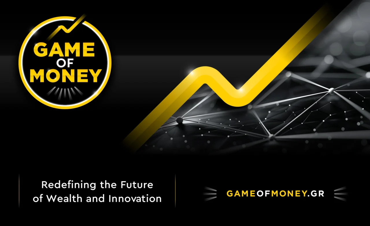

Game of Money is the largest financial literacy initiative in Greece, combining podcasts, seminars, e-courses, festivals, and a dynamic community of people who share the common goal of financial freedom. As an all-in-one educational brand, it makes financial knowledge approachable, engaging, and relevant to a wide audience.
For this project, Plus Gravity designed the main logo and a full set of sub-logos, including the Game of Money Podcast, Game of Money Club, Game of Money NFT Club, Game of Money Courses, Game of Money Teens. Our approach focused on clean, modern lettering and a strong visual system, perfectly suited for a platform that empowers people through financial education.
The resulting identity is consistent and cohesive, capturing the essence of Game of Money as both professional and approachable. Each sub-logo works seamlessly with the main logo, ensuring recognition and trust across every touchpoint, from academic seminars to international festivals.
A key element of the design is the distinctive line that extends beyond the circle’s boundary. This symbol reflects transcendence, continuous growth, and the power of knowledge to break free from conventional limits. It visually reinforces the core message of Game of Money: overcoming boundaries, whether set by society, institutions, or ourselves, and inspiring a mindset of evolution and financial freedom.
Through this project, Plus Gravity is proud to have contributed to a pioneering initiative that makes financial education more accessible and impactful, while maintaining a simple, bold, and memorable visual presence. Cheers to Alexios and his wonderful team. Higher levels of success, as you define it, are waiting ahead!
If this project inspired you to explore how a strategic visual identity can support growth across multiple products, services and audiences, we would be happy to discuss your next brand identity design and visual branding system project for growing organizations.